Introduction: Why Pivot Tables and Charts Matter
Pivot tables and charts are the Swiss Army knives of Excel. Whether you’re summarizing sales data, analyzing trends, or presenting results to stakeholders, these tools can turn raw data into actionable insights in seconds. This guide will take you from beginner to confident user, helping you unlock their full potential.
Step 1: Creating Your First Pivot Table
- Select Your Data
Ensure your dataset is structured as a table, with clear headers and no blank rows or columns. - Insert a Pivot Table
- Go to the Insert tab and click Pivot Table.
- Choose whether to place it in a new worksheet or an existing one.
- Build the Pivot Table
- Use the Fields Pane to drag columns into one of four areas:
- Rows: Group data by categories (e.g., regions, products).
- Columns: Create subcategories.
- Values: Display numeric data, such as sums or averages.
- Filters: Apply filters to focus on specific subsets.
- Use the Fields Pane to drag columns into one of four areas:


Example:
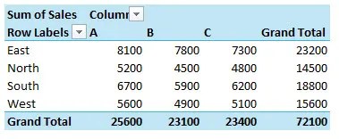
For a dataset with “Region,” “Product,” and “Sales,” drag “Region” to Rows, “Product” to Columns, and “Sales” to Values. The resulting pivot table appears.

Step 2: Customizing the Pivot Table
- Change the Summary Function
- Right-click a value and choose Summarize Values By (e.g., Sum, Average, Count).
- Apply Formatting
- Highlight your table and use the Design tab to apply a style.
- Format numbers by right-clicking a value and selecting Number Format.
- Sort and Filter
- Use dropdown arrows to sort by largest/smallest or filter specific data.

Step 3: Enhancing Insights with Pivot Charts
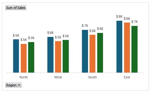
- Add a Pivot Chart
- Click anywhere in your pivot table.
- Go to Insert > Charts, and select a type (e.g., bar, line, or pie).
- Dynamic Data Updates
- Pivot charts are linked to your table, so updates reflect instantly.
- Use slicers to interactively filter data on both the table and chart.
- Customize Your Chart
- Add labels, change colors, and adjust axes using the Chart Tools tab.


Sizzle Tip:
Use a combination of slicers and timelines for interactive dashboards that wow your audience.
Advanced Tips for Power Users
- Use Calculated Fields
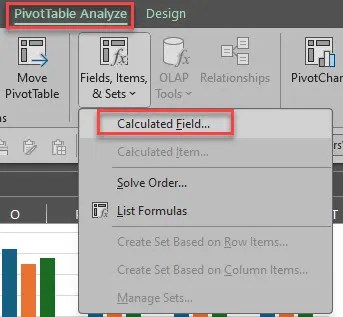
- Create new fields by selecting Analyze > Fields, Items, & Sets > Calculated Field.
- Example: Add a “Profit Margin” field with the formula
=(Profit) / Sales.
- Group Data for Better Insights
- Group dates by month, quarter, or year.
- Group numerical values into ranges for easier analysis.
- Connect Multiple Tables with Power Pivot
- Use the Power Pivot add-in to link multiple datasets.
- Build more complex relationships and create robust dashboards.


Common Mistakes to Avoid
- Using Non-Clean Data
- Always clean your dataset (remove blanks, fix headers) before creating a pivot table.
- Overloading the Table
- Keep it simple—don’t clutter your pivot table with too many fields.
- Forgetting to Refresh
- If you update the source data, right-click the table and select Refresh.
Conclusion: Mastering Pivot Tables and Charts
With pivot tables and charts, you can transform mountains of data into digestible insights. Mastering these tools will save you time and help you make better decisions, all while impressing your colleagues with professional reports.

This was so helpful! The steps were easy to follow to set up a basic pivot table and chart, and now I can summarize my data better. Thank you!
Glad you found this information useful.